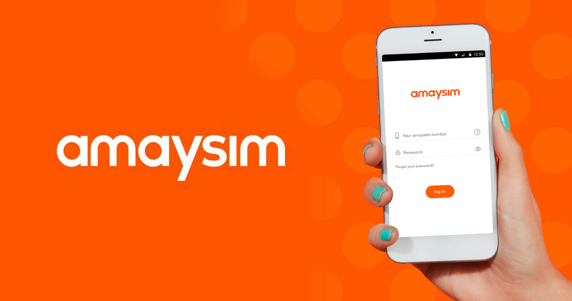
Brief
Whilst doing an uplift of amaysim's app, I wanted to find out what were the core tasks users were performing and focus on improving the experience on those key taks. After looking up amaysim's analytics I could see that the top tasks were:
- Change plan - 17,500 unique visits
- Usage - 15,000 unique visits
- View payment details - 14,800 unique visits
For this case study we are going to focus on the second top task; usage.
To find out what people thought of our usage screen I ran a simple guerrilla style user test, I printed out the usage bars on an a4 piece of paper and asked members of the public if they can tell me what is going on. During this test I also asked them which way the bar is going.
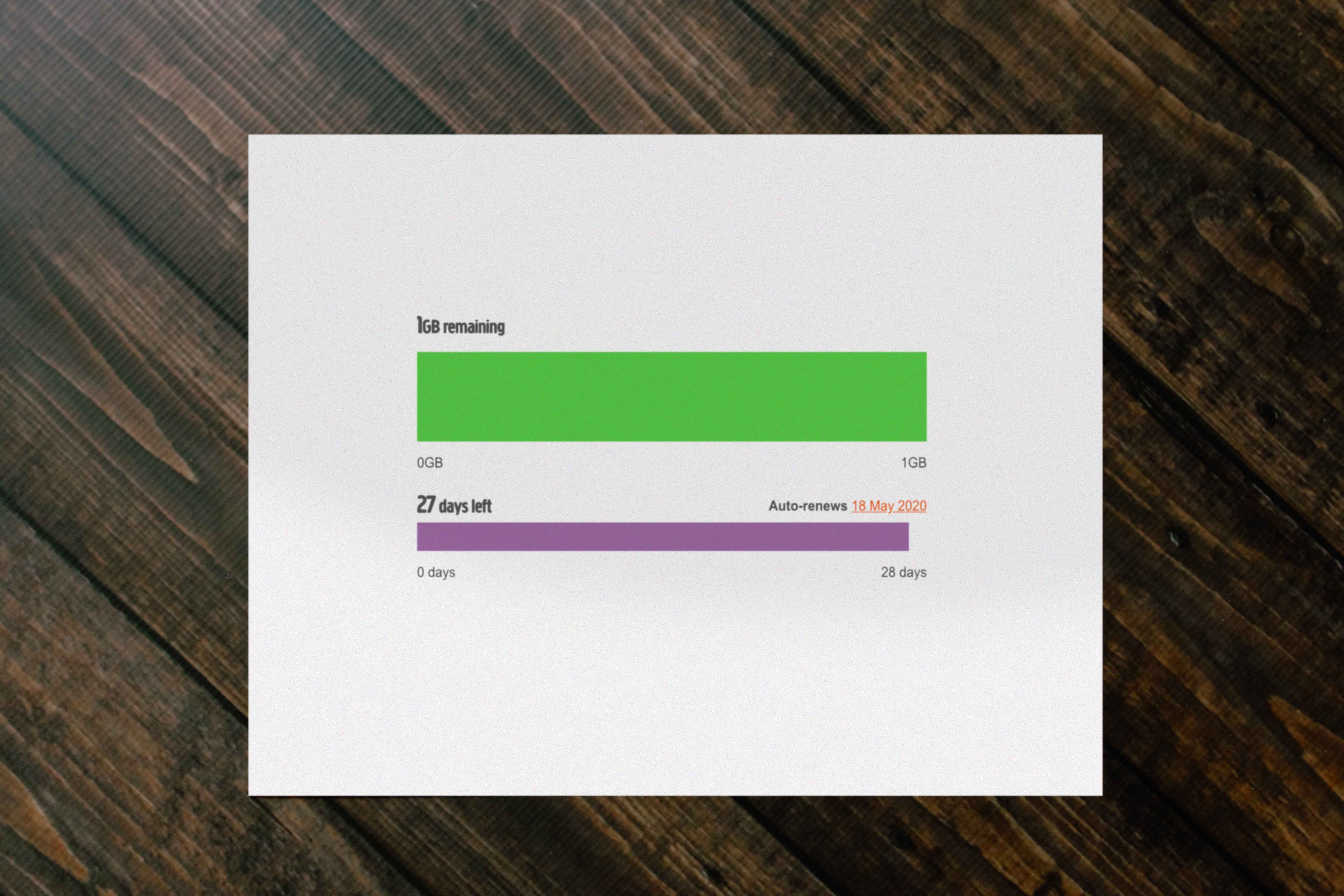
At amaysim the usage bars were moving from right to left as the customer uses up their data. 9/10 people I asked expected the bars to go from left to right.
Empathise
Instead of just changing the bars to go left to right, I wanted to know more about our customers, after the initial test I had more questions and I wanted to answer the following:
- When are people checking their data usage?
- Why are they checking their data usage?
- Where are they when they check their data usage?
- Is there a particular trigger or event that sparks people to check their data usage?
To find out more about our customers I set up 2 rounds of 5 customer interviews. From the interviews we noticed trends in usage behaviour types with amaysim customers, these were then created into personas.
The personas we created were:
- Data King
- Watchful parent
- Constant checker
Data King
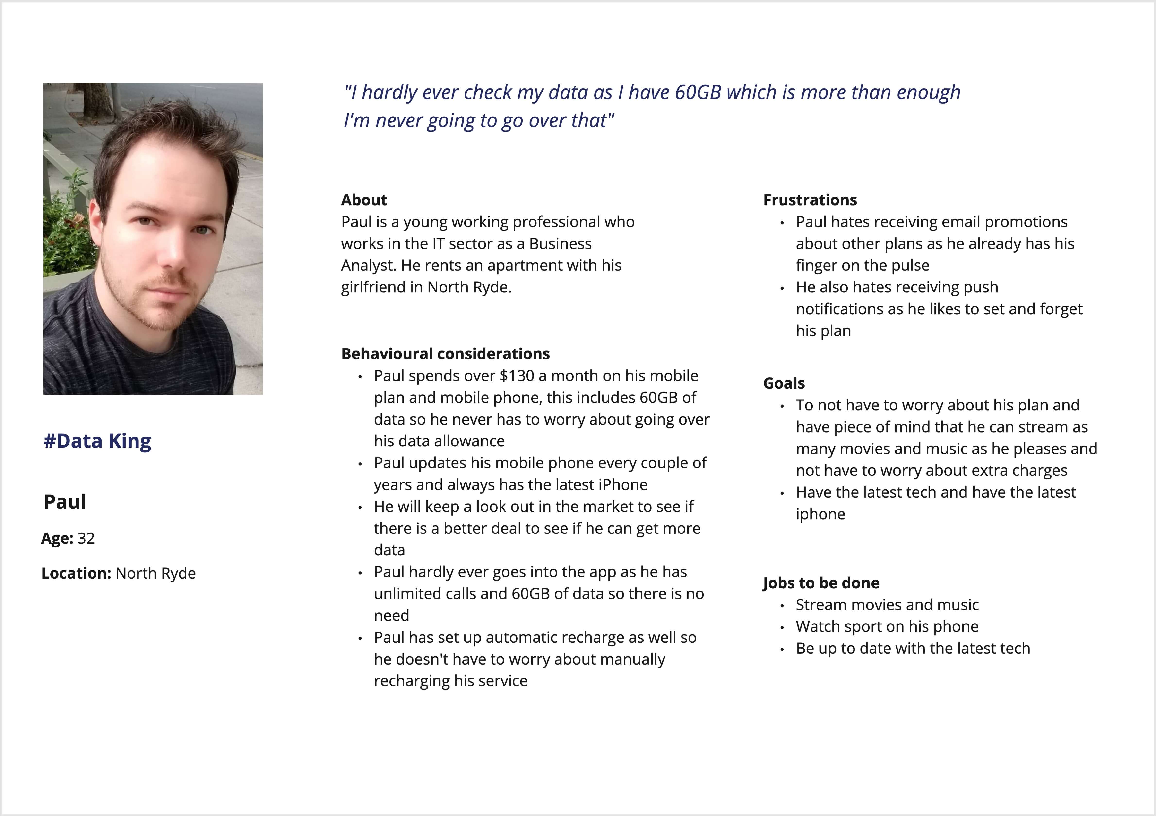
Data king aka Paul is someone who goes on the largest data plan they can afford. The reason for this is so they won't have to worry about their data usage. This persona doesn't fit within our test as he wouldn't be on of the 15,000 unique visits.
Watchful parent
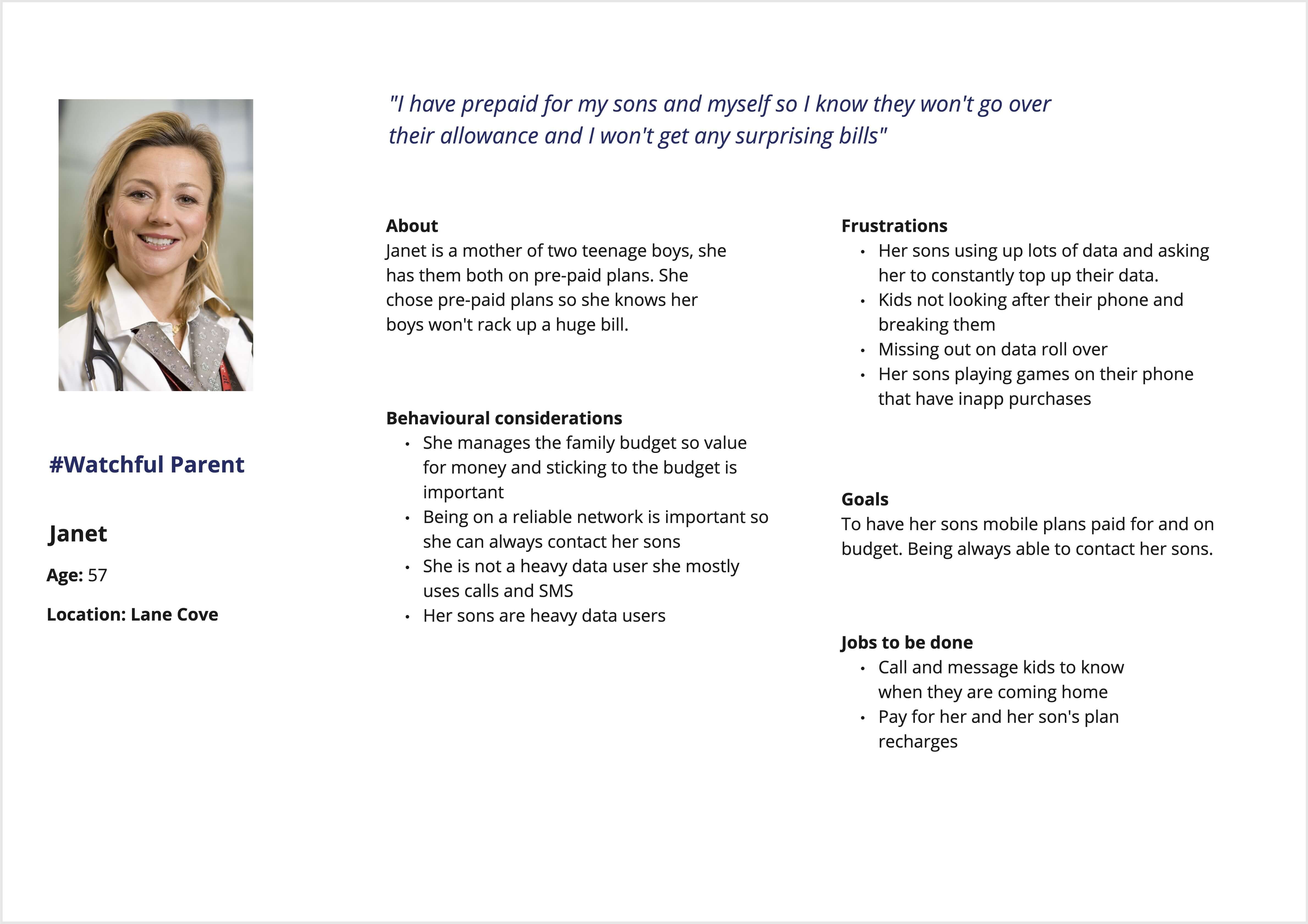
Watchful parent aka Janet is a full time mum of two teenage boys. She is in control of the household budget so he makes sure that no one is going over their data allowance. She personally doesn't use that much data, however her boys use lots of data and making sure they don't go over their allowance is top priority.
Constant checker
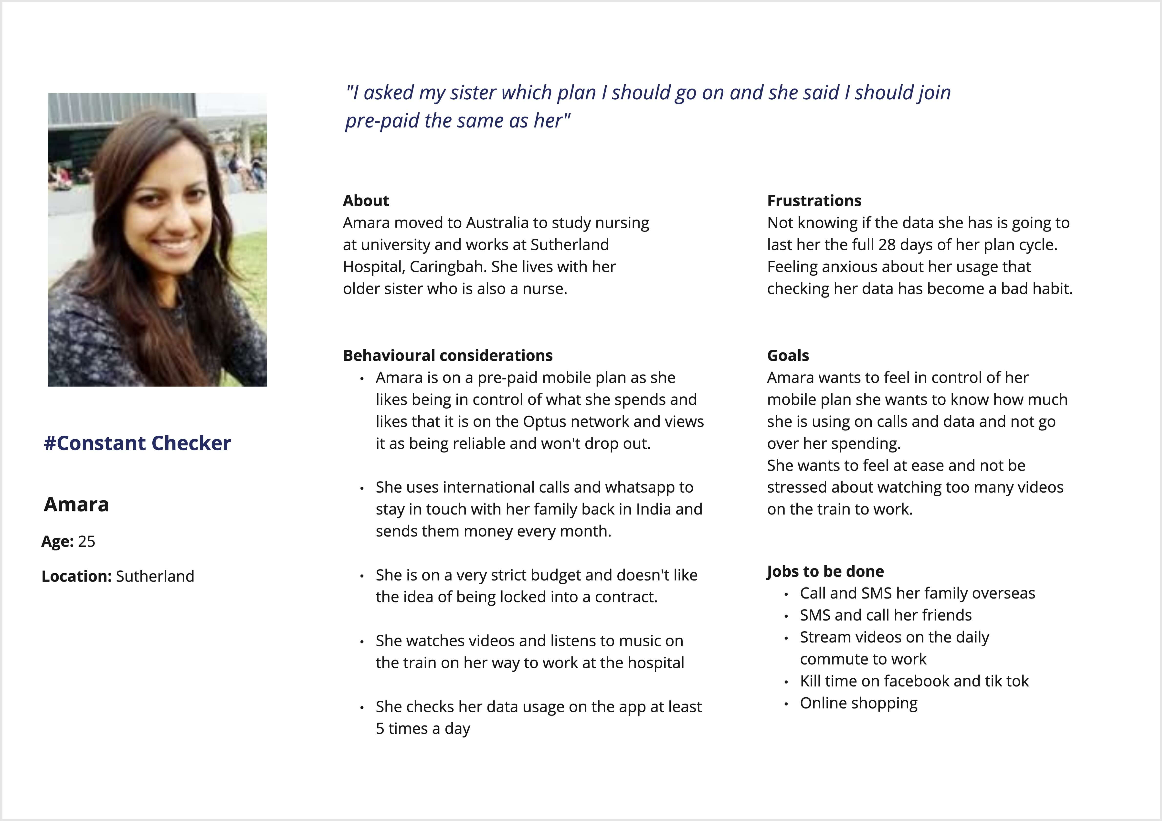
#Constant checker aka Amara is an Indian born 25 year old woman who has travelled to Australia to study to become a nurse, she lives with her sister and talks to her family and friends back home using whatsapp. Amara is someone who checks her phone many times throughout the day to make sure she isn't going to go over her allowance.
Talking with the team we decided to focus on Amara as she was an extreme persona and if we were able to cater to her needs other personas like Janet would benefit.
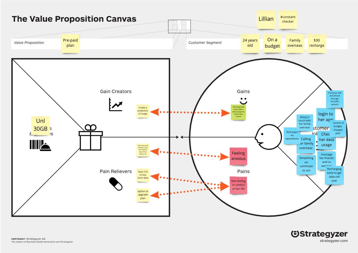
Value proposition workshop
After sharing insights with the team about Amara, I decided to run a value proposition workshop to really uncover this persona and see how to can best cater to her needs. In this workshop I showed the team a video on the canvas which explained it beautifully. After that the team which consisted of the director, BA, UI designer and Lead UX designer were all super keen to get involved.
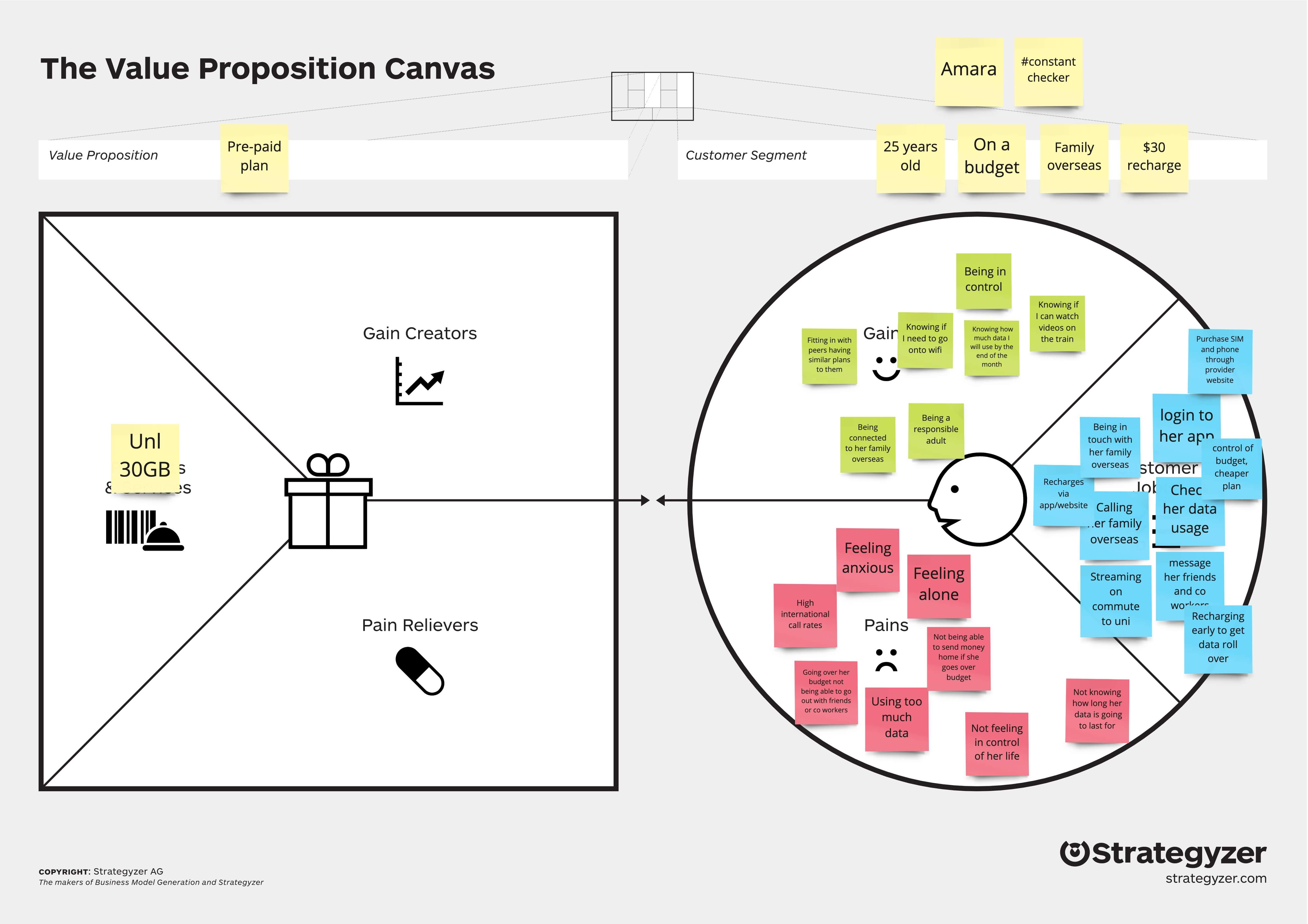
After going through each of the jobs Amara has to do with her pre-paid mobile plan I prompted the team to not only think about the functional jobs but alo the social and emotional jobs that her mobile plan plays in her life.
After getting the team to think broader about Amara's life around the emotional and social implications that her mobile plan has it really helped the team to gain an even deeper empathy for Amara.
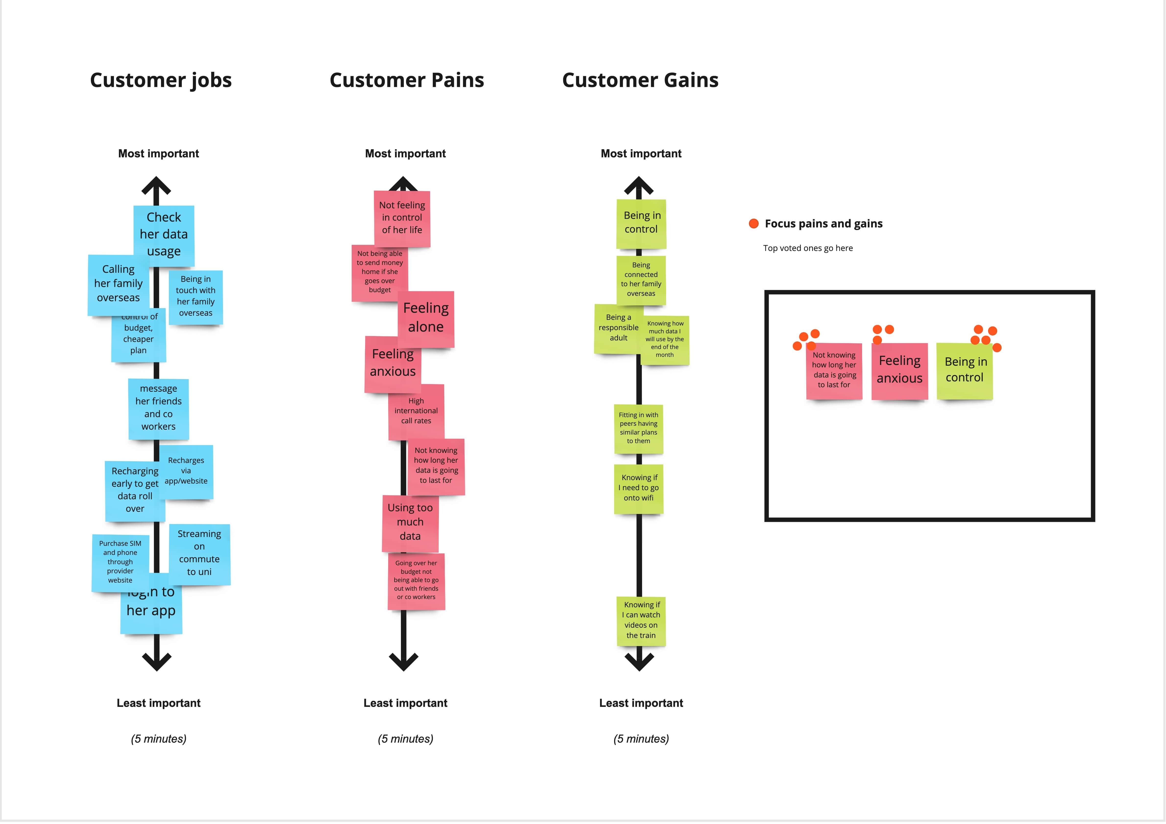
After going through each of the sections for the customer profile of the canvas, I then got the team to rate each of the sections from most important at the top to the least important at the bottom. From those three rating scales of prioritised jobs, pains and gains I then asked the team to dot vote on which ones we all felt were worth exploring.
The three items that had the most votes were:
- Not knowing how long her data was going to last for
- Feeling anxious
- Being in control
From these three items I then re-wrote these issues into opportunities by creating 'How Might We' (HMW) statements.
We merged the three items into the two following statements:
- How might we: Help Amara know how long her data is going to last?
- How might we: Give Amara a greater sense of autonomy so she feels less anxious about her data usage?
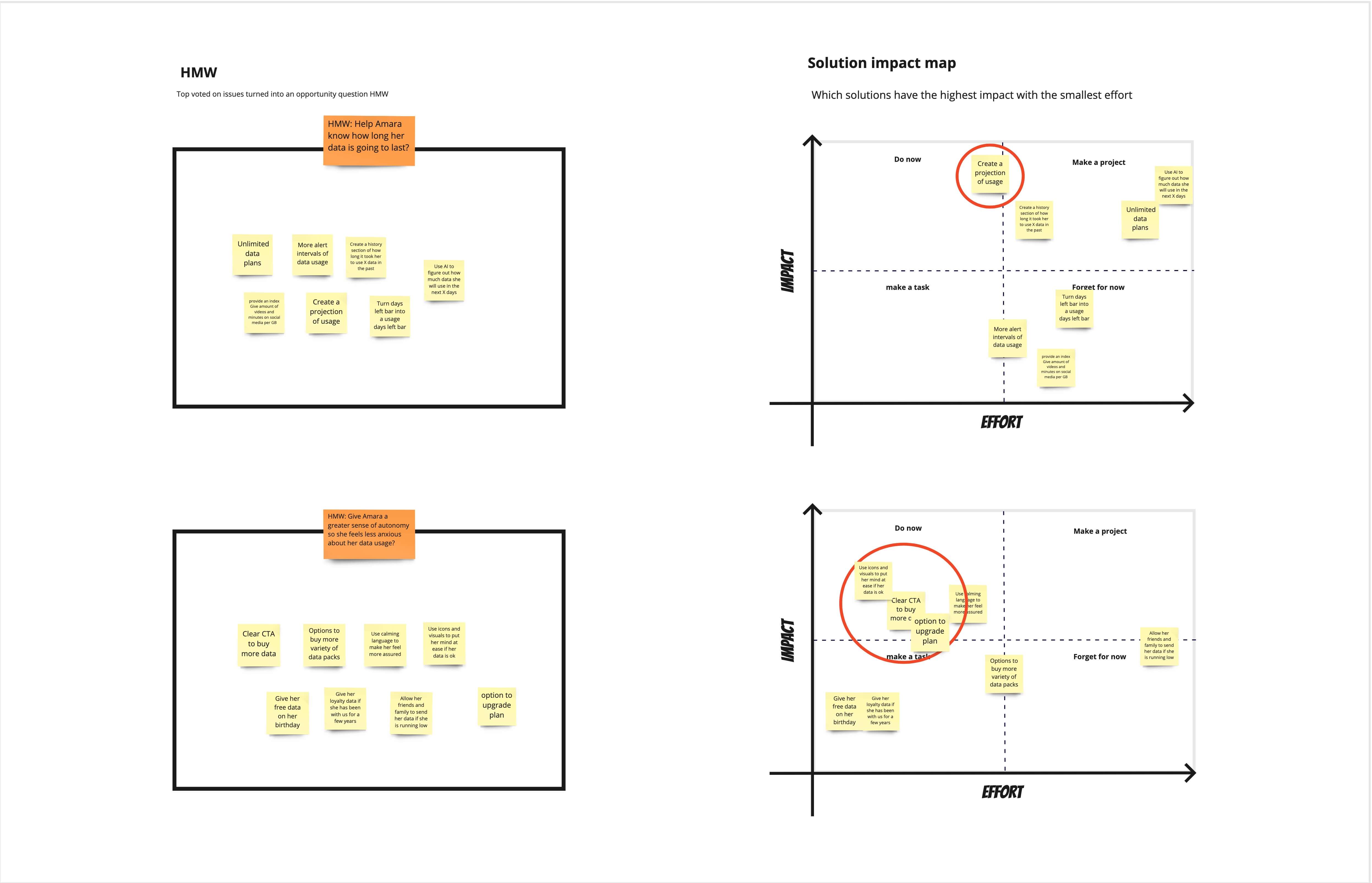
HMW: Help Amara know how long her data is going to last?
I gave the team 5 minutes to come up with as many ideas as they could to solve the first how might we statement. We then put each of the ideas on a 2x2 impact map. The impact map has four compartments the x-axis represents the effort it would take to implement the idea and the y-axis respresents the impact it would have on Amara. The idea here is that we want to go after ideas that would have the most impact with the least amount of effort required.
Out of the seven ideas that were presented we all agreed that the best one would be to 'create a projection of usage' to Amara so she wouldn't have to worry constantly wondering if she would go voer or not.
HMW: Help Amara feel less anxious about her data usage?
We then did a second 5 minute time box exercise to tackle this might we statement. As the two HMW statements are related we wanted to focus more on the emotional side of this scenario, how would we make her feel less anxious. We placed all the ideas on another 2x2 impact map and the winning ideas were:
- Provide visuals and messaging to put her mind at ease
- Provide clear CTAs to give her creater sense of autonomy to buy extra data
- Give her helpful messaging if she has gone over her data in two consecutive months an option to upgrade her plan.
I then went back to the value proposition canvas and placed the chosen ideas (pain relivers and gain creators) and paired them with the pains and gains of Amara. This helped my director and lead know we were set out to achieve and helped me get buy in from outside stakeholders as well.
The next day after the workshop I then sat down with the team and spoke about how we would implement the 'projection of data'. We then started talking about what if we calculated the 'burn rate' and used data modelling to figure out much data she would use way before the end of the cycle. This was a great turning point in the project as we were using design thinking to reimagine her data usage.
The BA of the team was super talented and she worked out a formula of how we could predict Amara's future data usage. We then asked what was the minimum amount of information we need to make this forcast. We then had a meetin with the data analytics team and they said this should only need a few weeks. We were all very excited that this idea is becoming a reality.
I then sat down with the UI designer and we sketched out some ideas of how we could implement all of the ideas we had in the workshop.
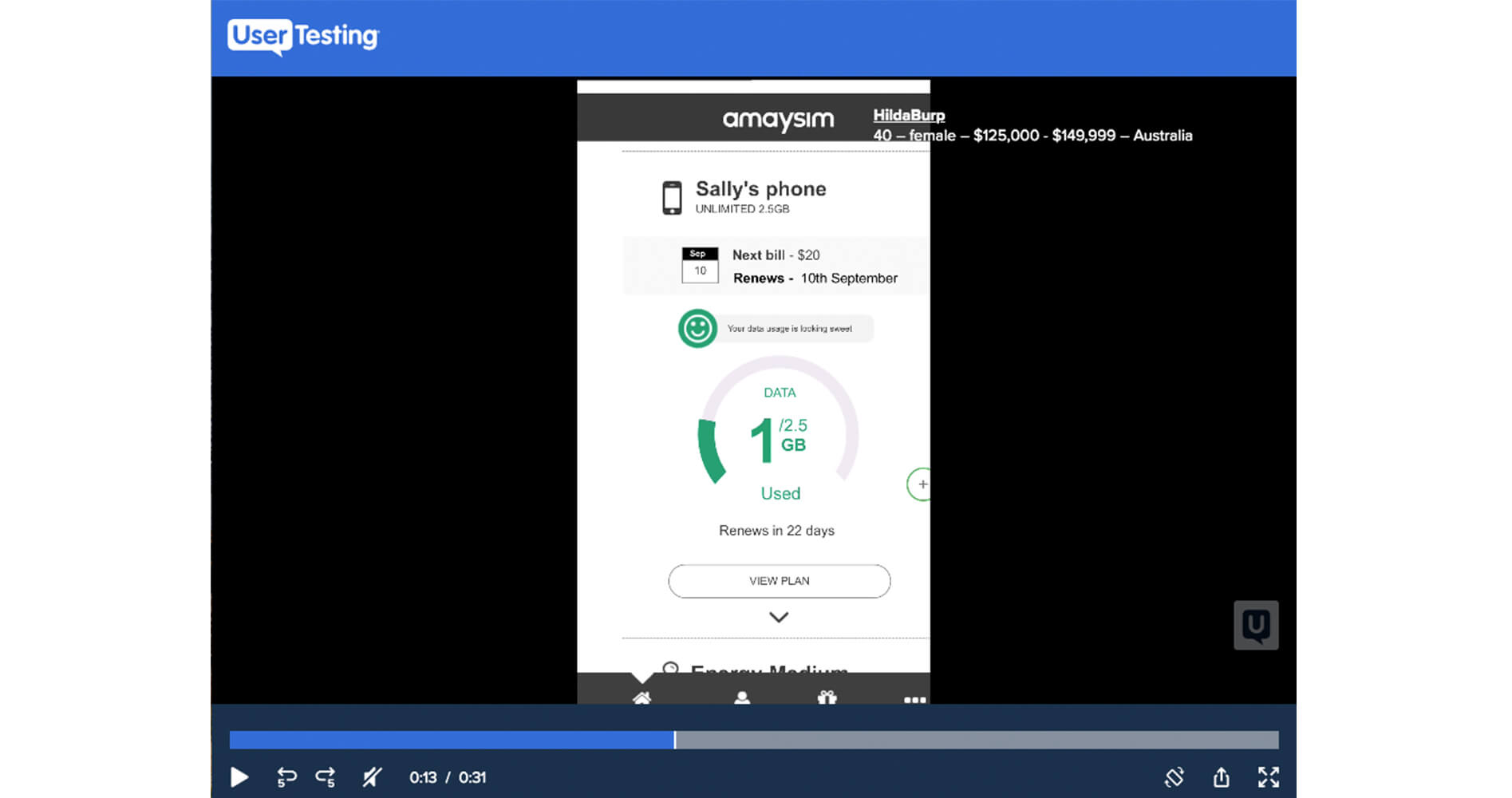
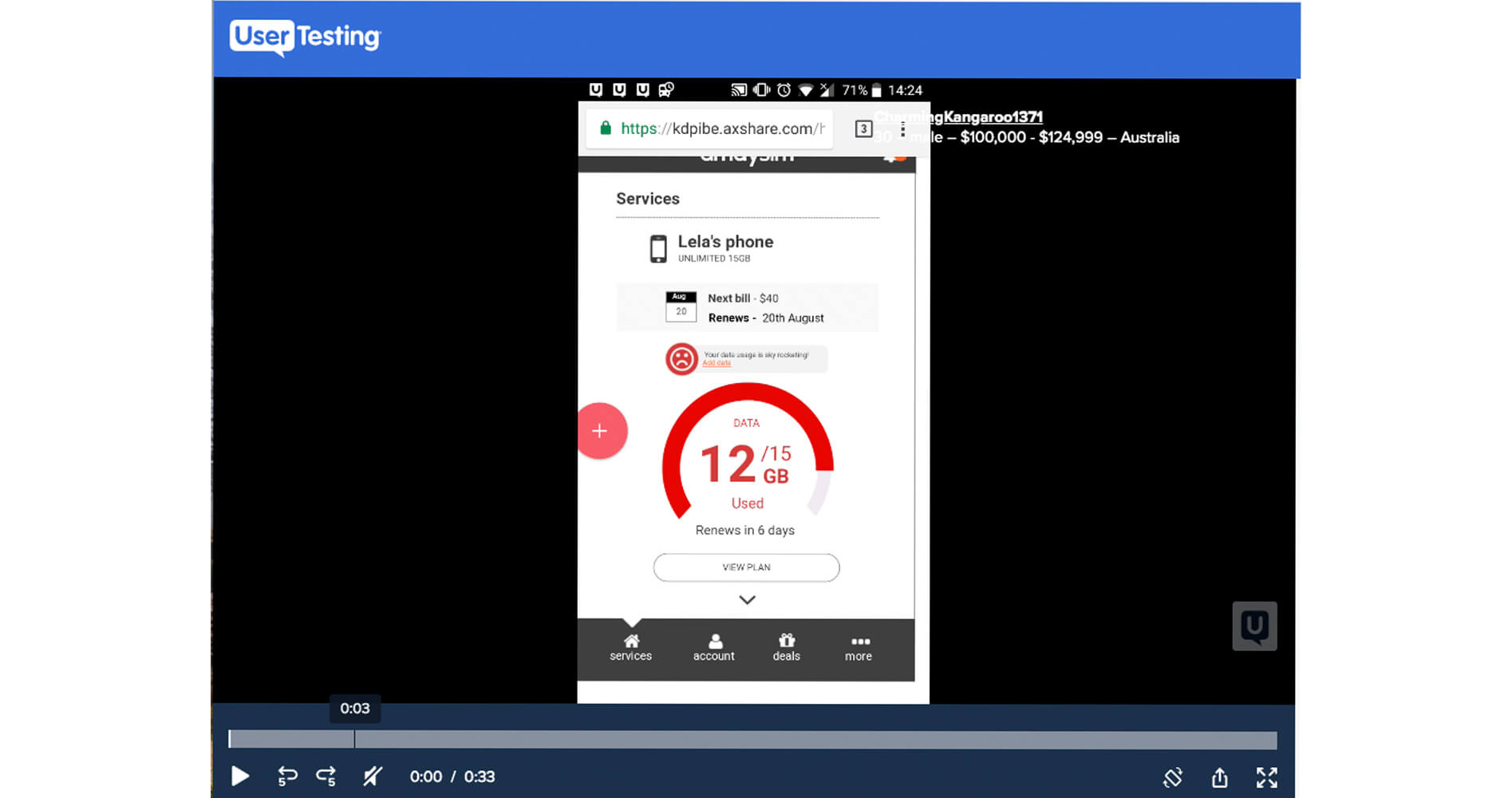
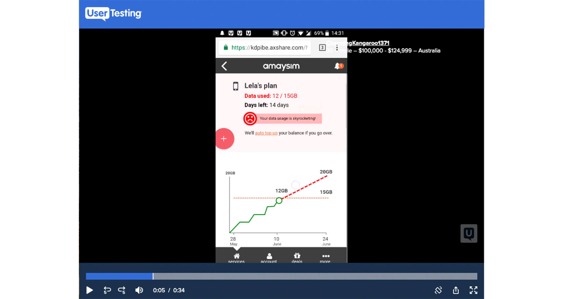
The ideas we came with varied from stop signs, hand gestures and even animals, the one we landed on to create an emotional connection to put Amara's mind at ease was faces. We created a happy face for when the usage was on track and going well, a neutral face for when the user was just over their data usage and a sad face for when the user was going way above their data usage.
Bringing the traffic light idea into the faces we gave each of the faces a colour coded background for each. Green for a happy face, orange for a neutral face and red for a sad face. The business thought having a neutral face was too confusing so we paired it back to two faces the happy and the sad face.
Wireframes
We then put the faces and the projection together on the screen and these were the wireframes I created.
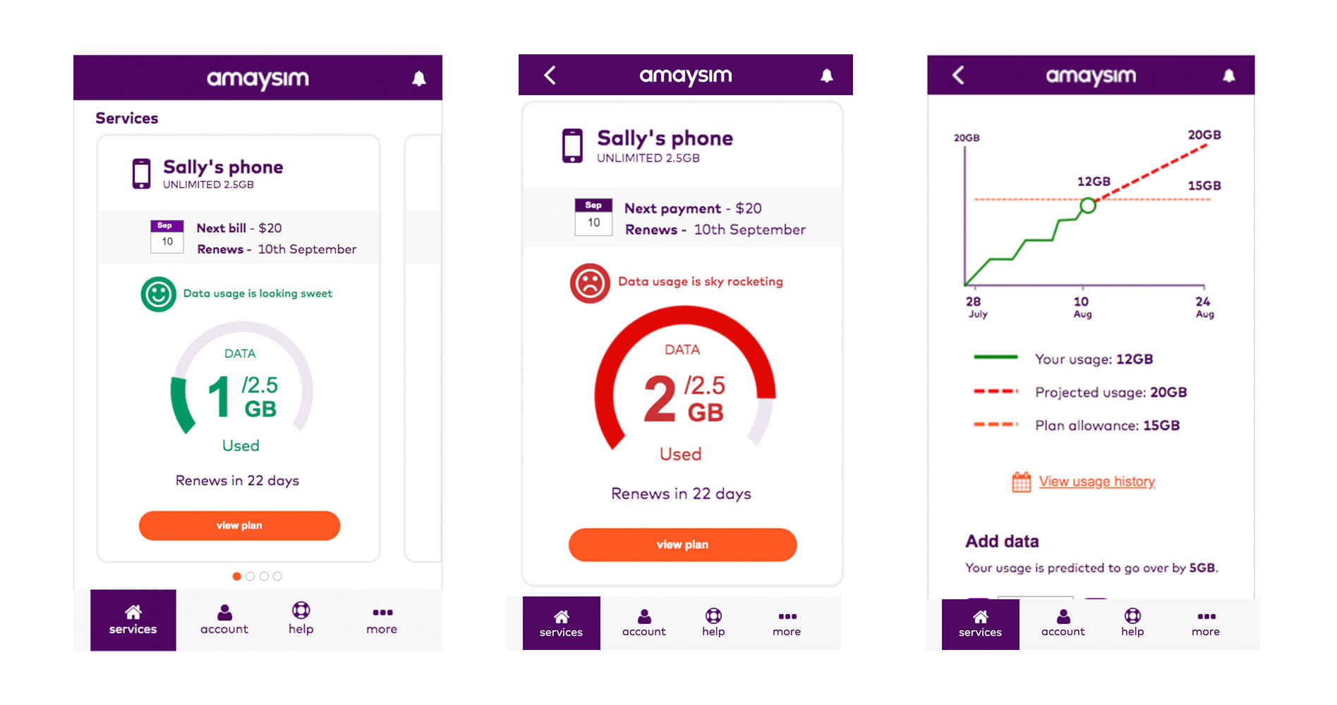
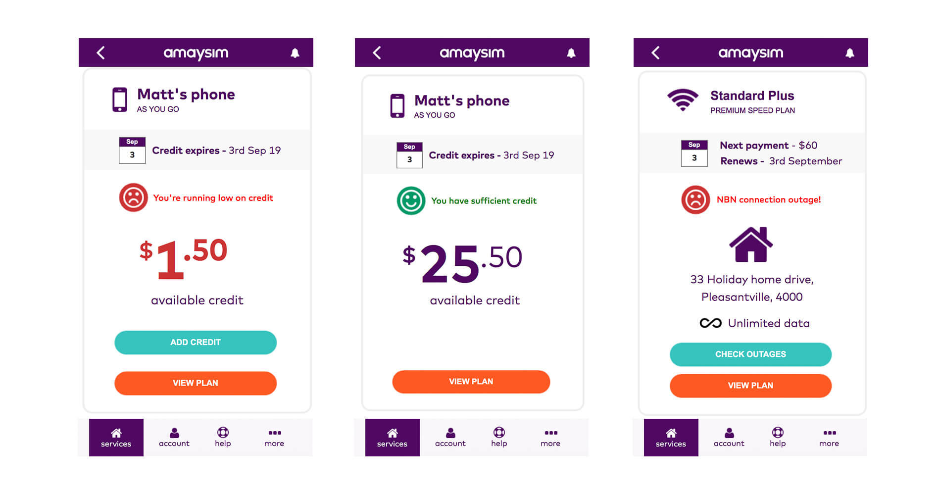
I then applied these usage alerts to the main tasks, including add data and upgrade plan as shown below.
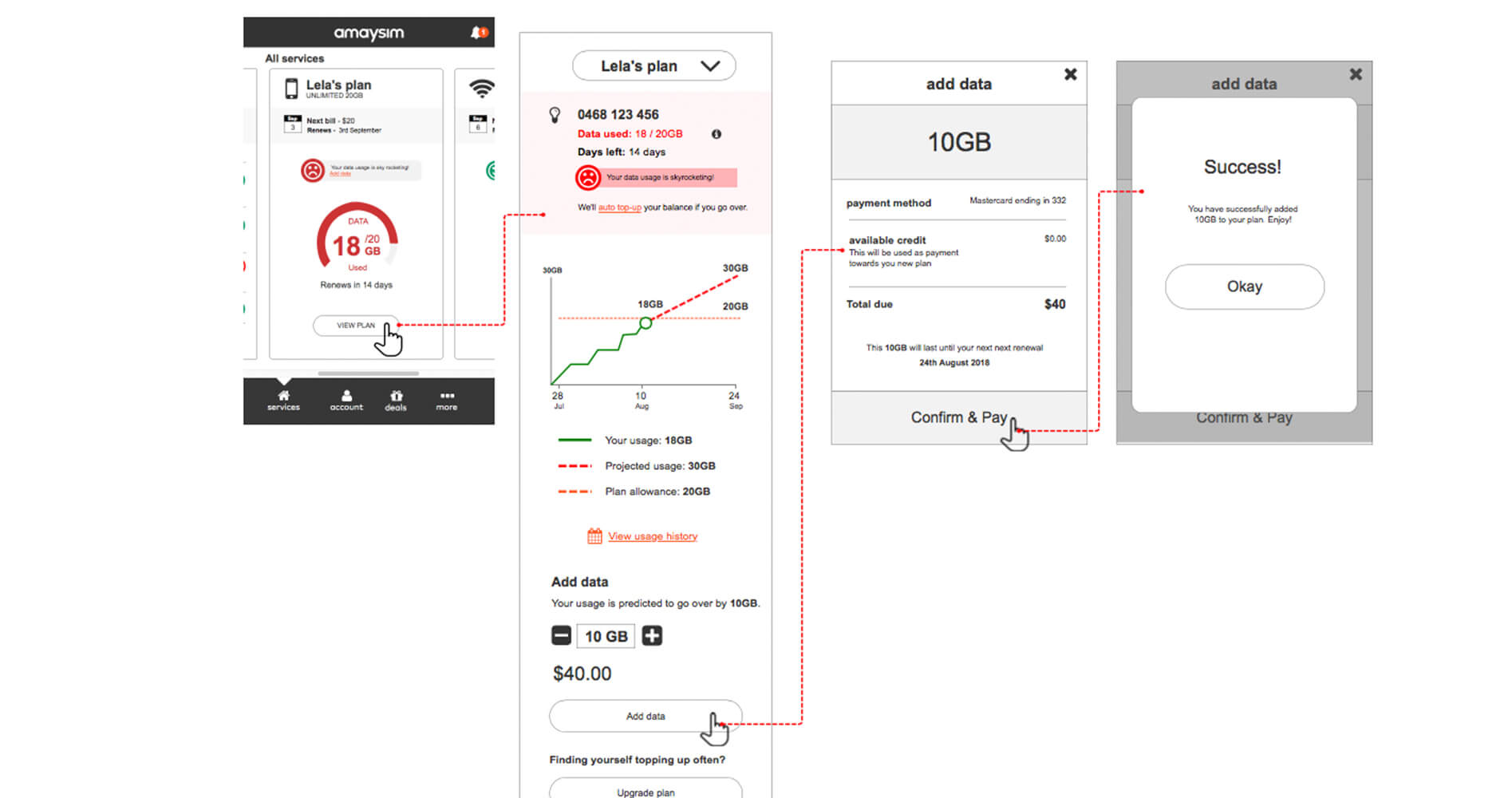
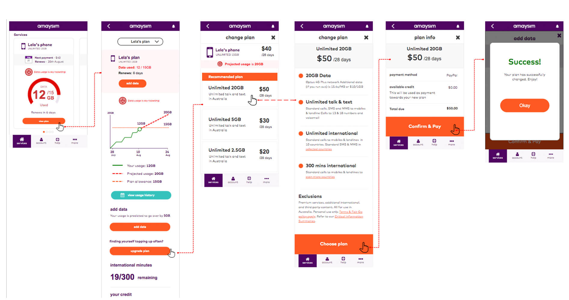
I ran a user testing session with five participants using these new wireframes to see what reaction people would have with them.
People were interacting with the face and this is exaclty what we wanted, we wanted to create an emotion with the user about their data usage and help them understand what to do.
P3 "It gives you immediate feedback, I like that it is red and green like an alarm bell if you need it"
P2 "I really like the faces it shows me easily how my plans are tracking"
P5 "Oh no, I now have a red frowning face, I want to make sure I have the smiley face back again so I would add more data (laughs )."
Go live results
Not only did this new design have an emotional impact with our participants when we tested it, it also translated in a business sense as well. We looked at the analytics three months before going live with the new design and compared the same figures three months after the new design and we saw the following:
- Data pack sales went up 80%
- Plan upgrades were up 35%
- Upercentage of traffic went down from around 15% to 8.5%
Retro
Reflecting back on this project there are a few things I would do differently. I would have asked the why sooner rather than running after business men in the city asking them about usage bars. I would also have extended the workshop to include a crazy 8s after the value prop meetin to get more ideas of how to illustrate them even though the UI designer did an amazing job.
This project was a great learning experience and taught myself as well as the team the importance of looking beyong the obvious functional tasks people for with products and services but also to dive deeper into the emotional and social drivers as well. That way we are able to create an even greater sense of empathy for our users but also create more meaningful products because of it.