
The Project
I was brought onto the project as the only UX designer, as I was the only UX designer within the company to redesign the Hit website and creation of the Hit media player.
Due to technical constraints at the time, the player needed to be separate as the music or show would stop playing when the user visited another web page. To get an understanding of what Southern Cross Austereo wanted to achieve with this project I ran some stakeholder workshops to define what success looks like.
Workshop
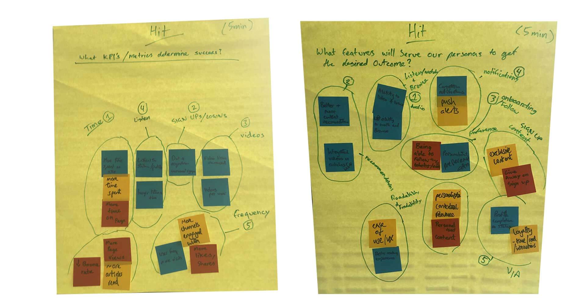
In the first part of the workshop I asked the key stakeholders to write down on post it notes what were the Key Performance Indicator and metrics will determine success of this project. I time boxed this exercise to 5 minutes. After the 5 minutes we grouped the post it notes into themes. The themes that emerged were...
- Time - More time spent on the website so they view more ads and in turn SCA makes more money
- Sign ups and Logins - Having more members to serve up personalised content
- Videos - The more videos users watch the more video ads they watch and hence more ads
- Listen - To make it easy for users to listen to shows and podcasts
- Frequency - Have returning visitors of the site
The second part of the workshop I asked the stakeholders to then think of features that would serve our users to get these desired outcomes.
- Listen & Browse - Have a video follow the user down the page when reading an article
- Artice recommendations - Have similar articles recommended tot he user
- Following content - A star or follow button on shows and categories
- Notifications - Show notifications to users to get them back on the website
- Loyalty - Joining the VIP program
Now that I know what the businesses needs are for this project I now needed to understand who were Hit's users and what were their needs. I needed to get stakeholder buy in so I came up with a research flow of what I was planning.
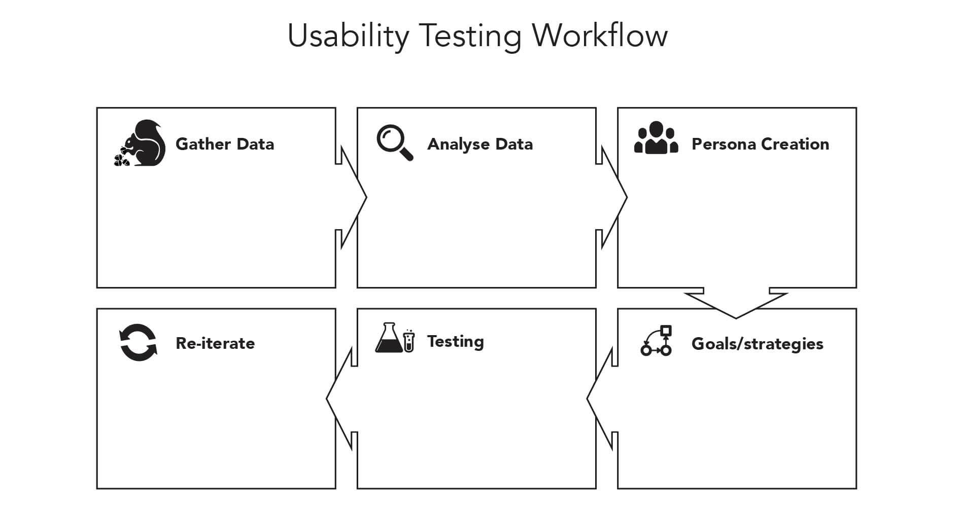
My research flow consisted of six parts.
- Gather data
- Analayse Data
- Persona creation
- Set goals and strategies for what we were going to test and how they aligned with the businesses KPIs and Goals
- Testing
- Re-iterating the test based off feedback
1. Gather Data
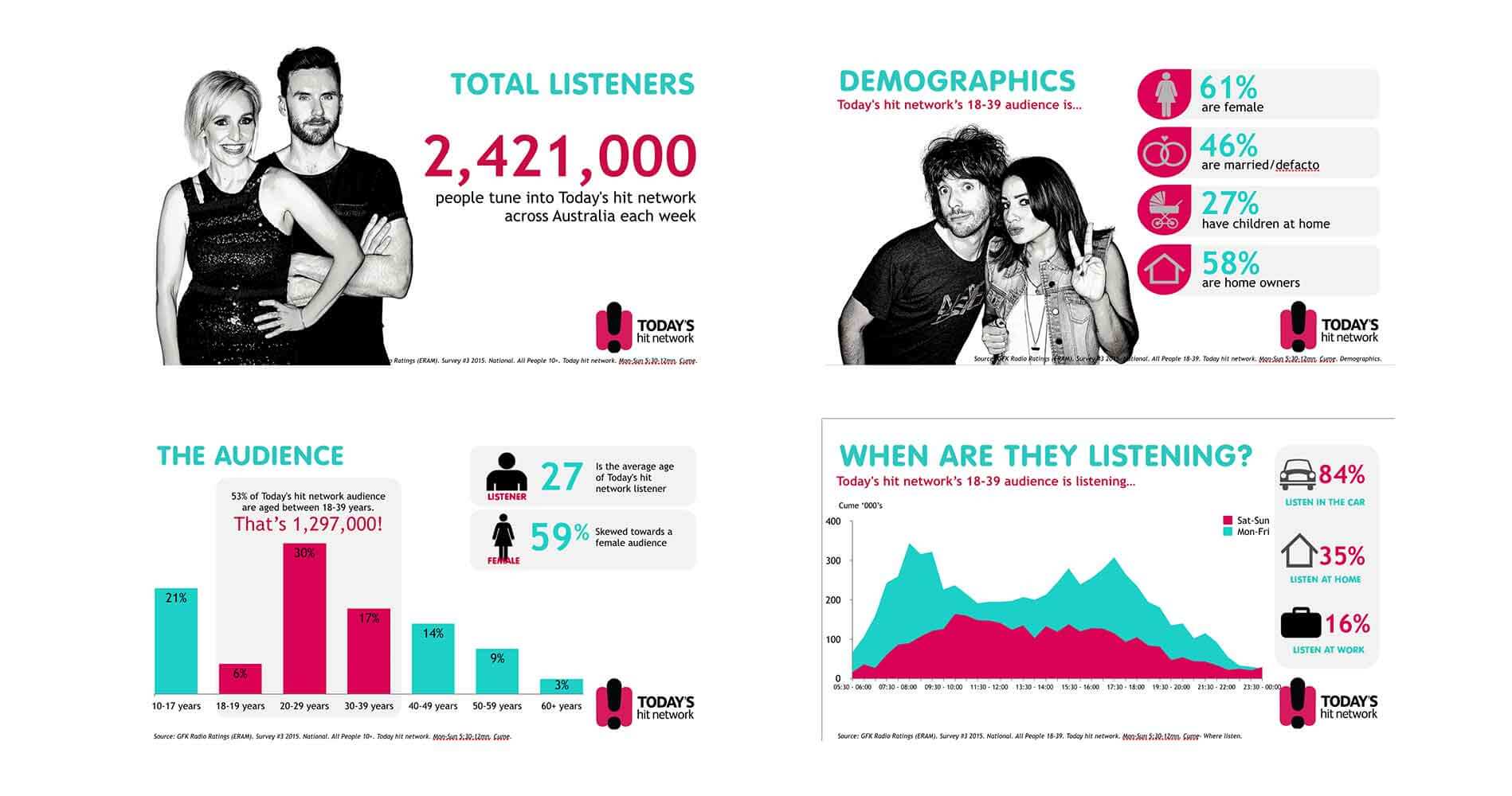
Before I started recruiting people I wanted to gather as much data as I could that was already existing at SCA. I first logged into SCA's Google Analytics account and got a high level snapshot of the session and audience data.
To get a complete picture I had to look at more sources of data, I then reached out to the marketing department to see if they had done any previous research on SCA's users. They came back with a pack that they call a Brand Aid which was a run down of the market research that a specialised team had worked on. This was great as it gave me another perspective on SCA's users.
I wanted to know more, this was great qualitative data, I also wanted to get some quantitative data, so I asked if I could send out a survey to the listener base. I was allowed to do so which was fantastic.
2. Analayse data
After all of these findings I wanted to lay it all out so I created a Lean Canvas.
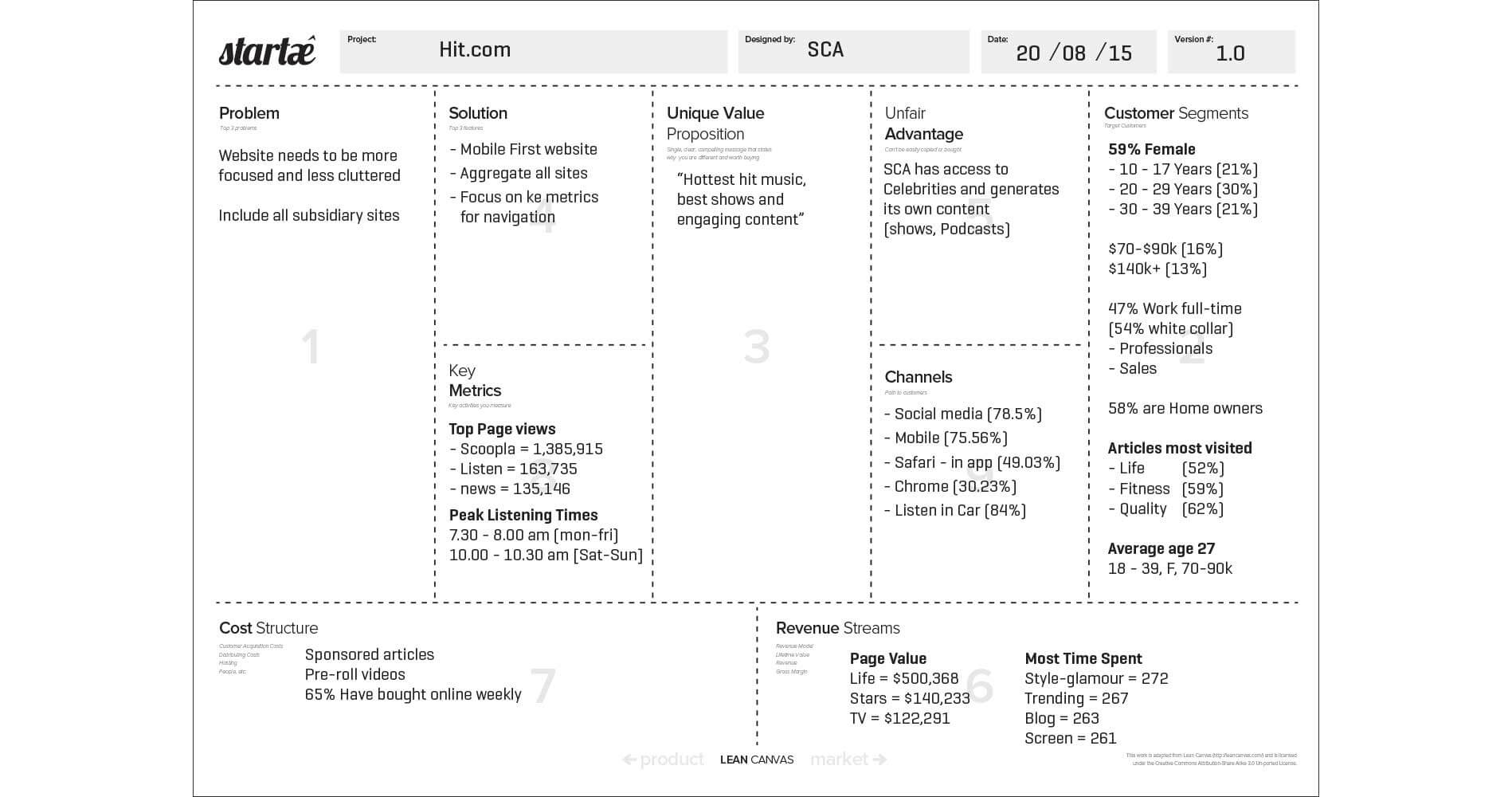
This was a great tool to get visibility and show stakeholders how each of the findings comes together.
3. Persona creation
With all of the data that I had collected I felt confident that I had a good base to create a first round of personas which will be updated the more we find out about our users.
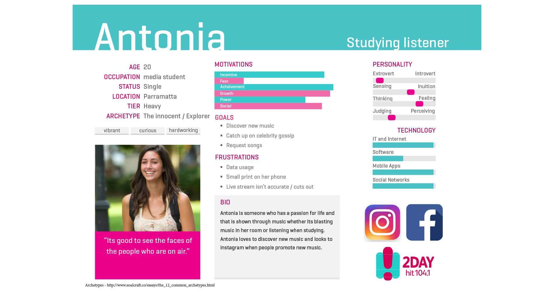
Antonia 20, is a university student studying media she is someone who has a passion for life and that is shown through music, wether it is blasting music in her room or listening to music to help her study.
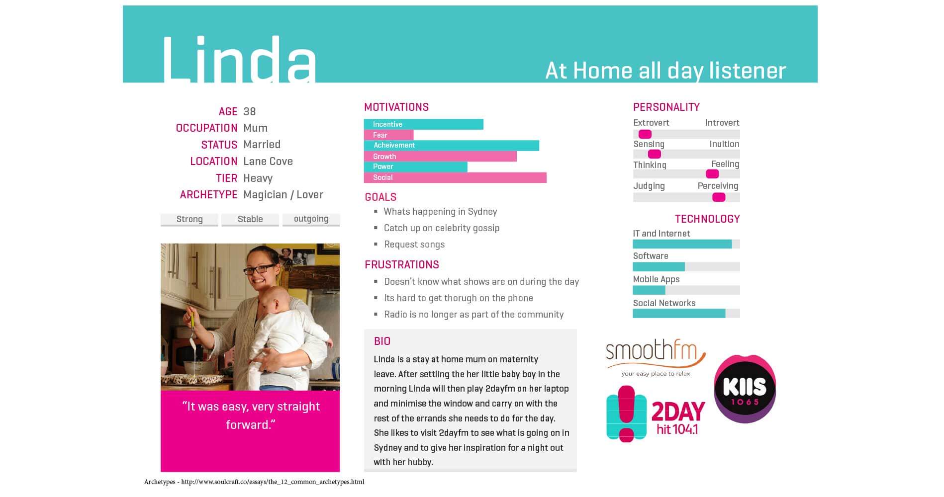
Linda 38, is a stay at home mum on maternity leave. After settline her little baby in the morning she will then play 2dayfm on her laptop and minimise the window and carry on with the rest of the errands she has to do for the day.
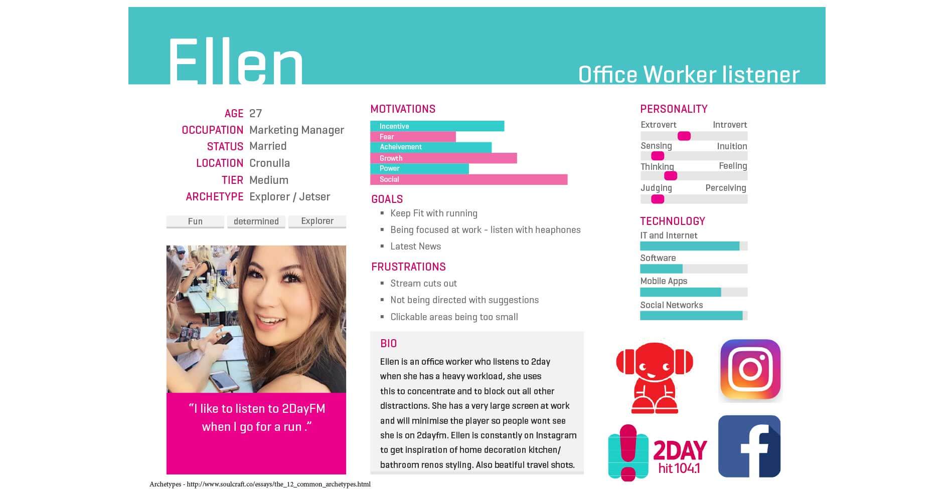
Ellen 27, is a Marketing manager she listens to 2dayfm when she has a heavy workload on, she uses this to block out all other distractions so she can carry on with her work. On the weekends she also likes to listen to the radio when she goes for her morning run.
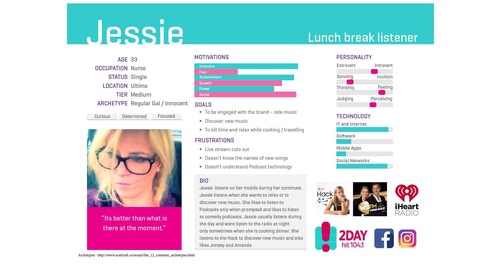
Jessie 33, is a Nurse, she listens to the radio on her mobile during her morning commute on the train. Jessie when she does gets a lunch break will listen to music during that time and will also want to discover new music via 'The Hack' radio show.
Findings
From interviewing SCA's users I uncovered that there were two common themes.
- Users want to be in control of what they listened to
- They want to be able to discover new music
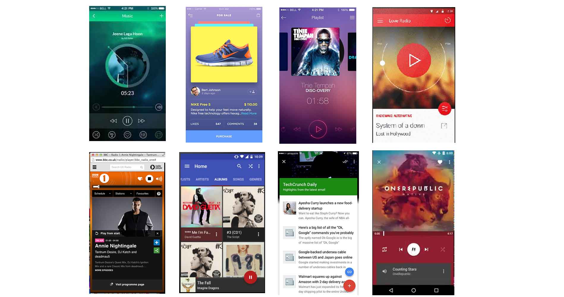
Competitor Analysis
To get un understanding of what else is out there in the marketplace I looked at direct and indirect competitors of SCA to see what they were doing in this space and if there were common patterns that people would be used to and if we could learn from these.
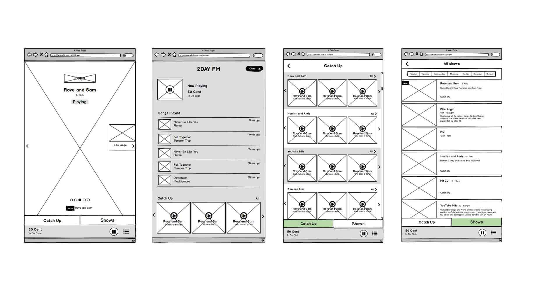
Wireframes
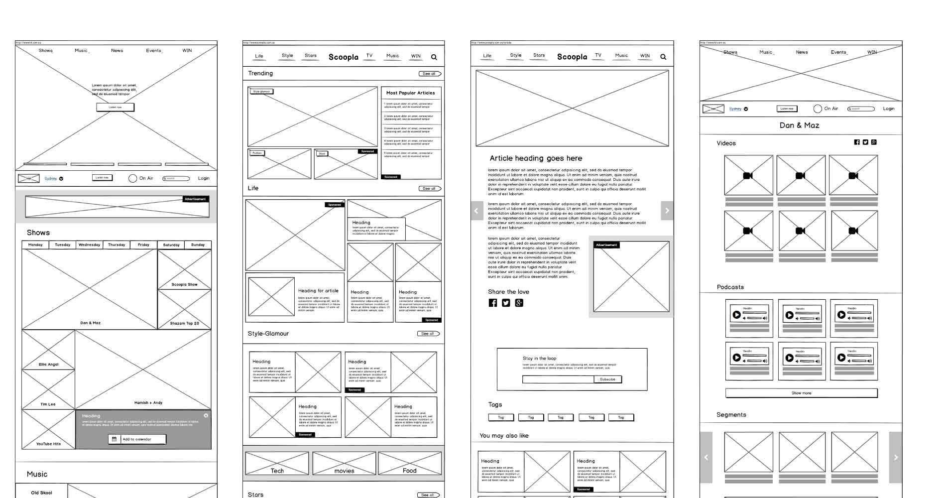
Mock ups
4. Goals / strategies
My goal from a listeners standpoint was to come up with ideas on how might we give listeners more control of what they were listening to and how can we help them discover new music.
From a business stand point I knew based off the stakeholder workshops that they wanted users to spend more time on the website reading articles, litening to shows and watching video content.
so I ran an ideation session. I got all of the stakeholders to write down as many ideas as they could think of in 5 minutes on how we can achieve each of these goals. Once the stakeholders had all of their ideas we voted on which ideas we thought were worth exploring. These ideas were...
- Infinite scroll of articles
- Videos following people down the page as the read articles
- Follow button for categories and shows
- Article progress bar to encourage people to keep reading
- List of song history on the media player
- Have a highlights section of each of the shows
How users could spend more time on the website
How we could give users greater control and help discover new music
In order to know if what were proposing was improving time on site and number of webpages visited I needed to first establish a baseline. A baseline of how long users spent on the website and how many pages they visited. I found from Google Analytics that...
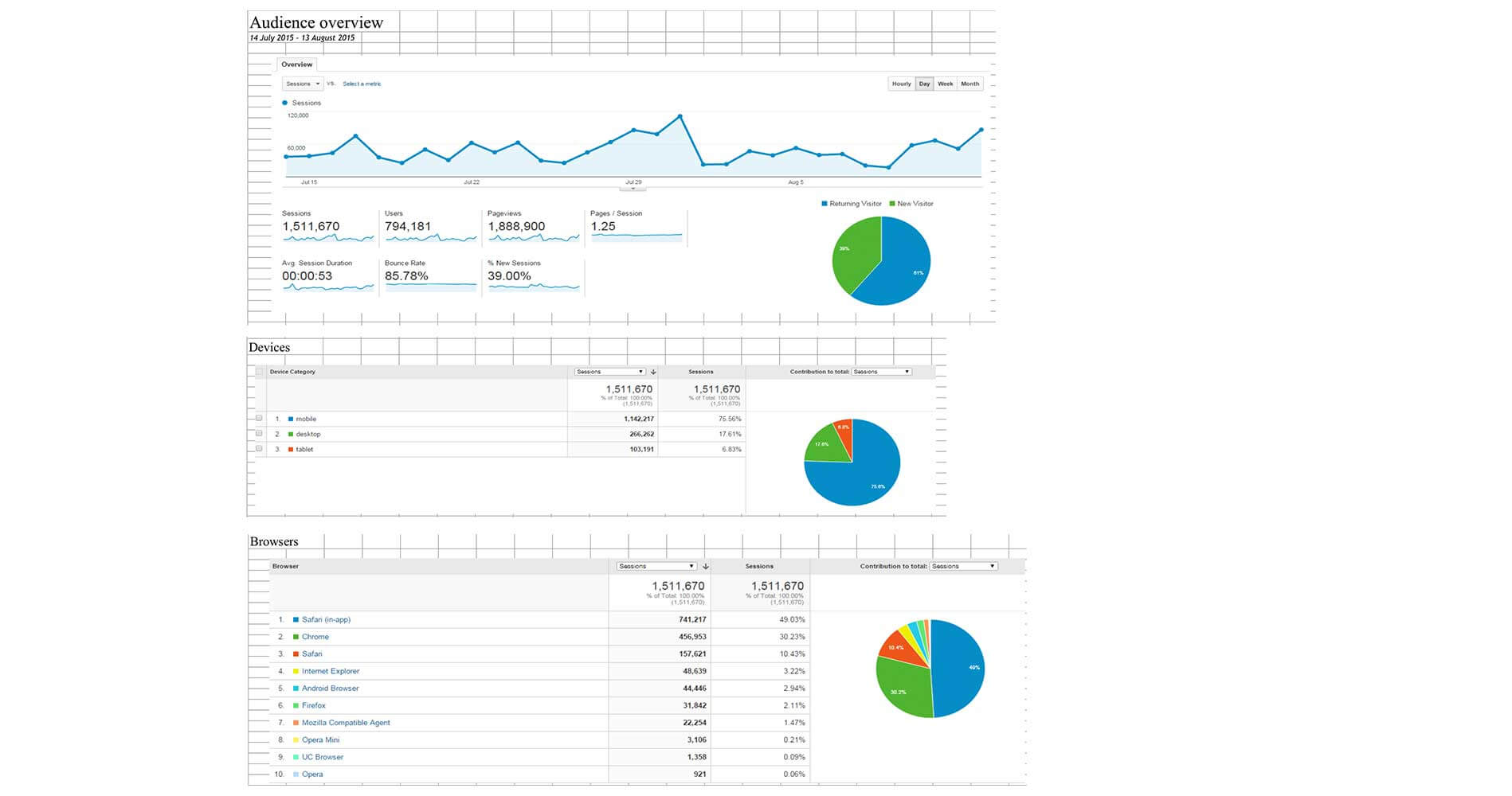
- Users viewed 1.25 pages per session
- The average duration they spend on the website is 53 seonds
5. Testing
So to validate our assumptions I came up with some prototypes to experiment with to see if these ideas would work. To test these ideas I recuited 15 people, 3 rounds of 5 and tested all of the ideas.
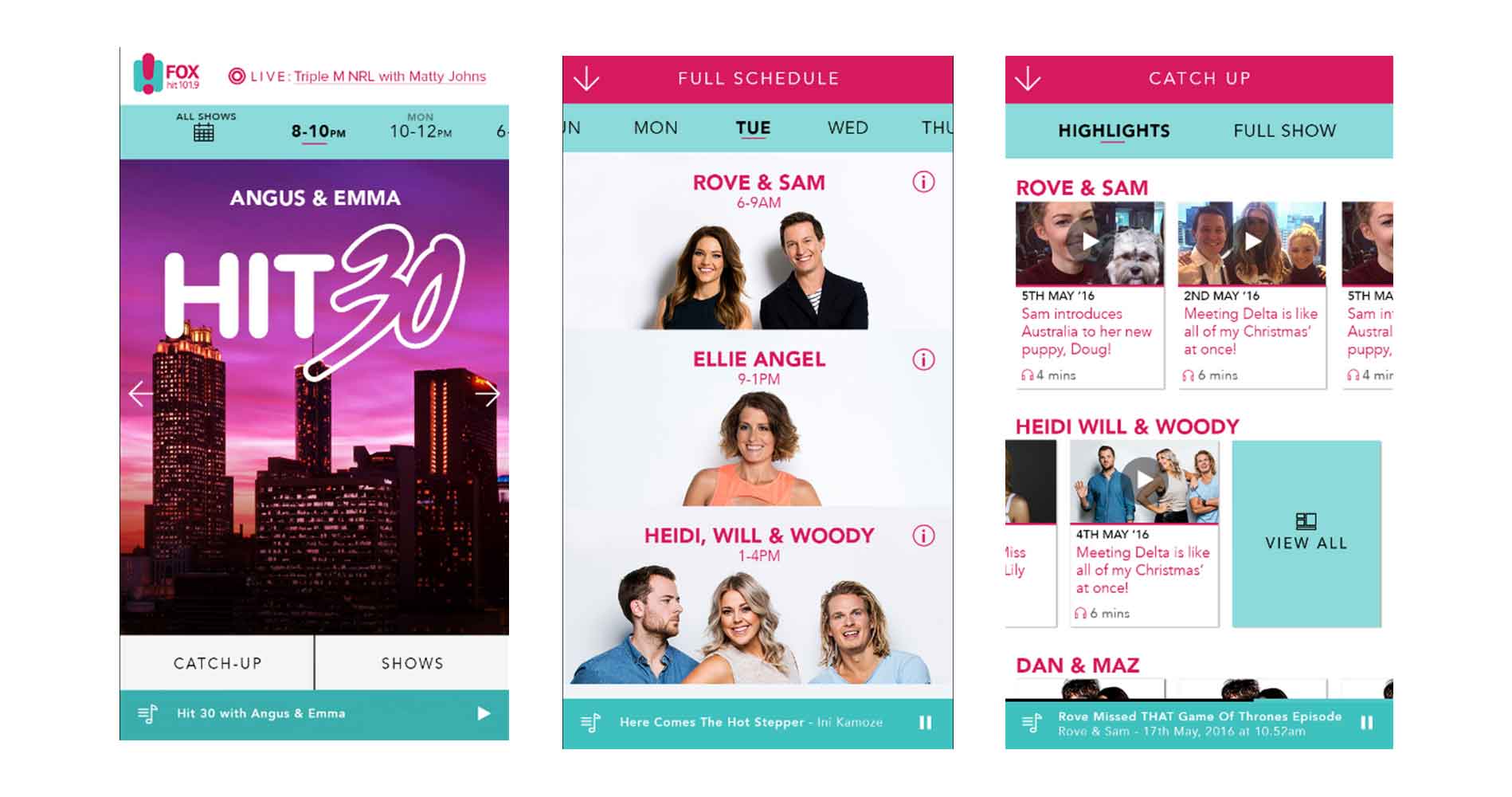
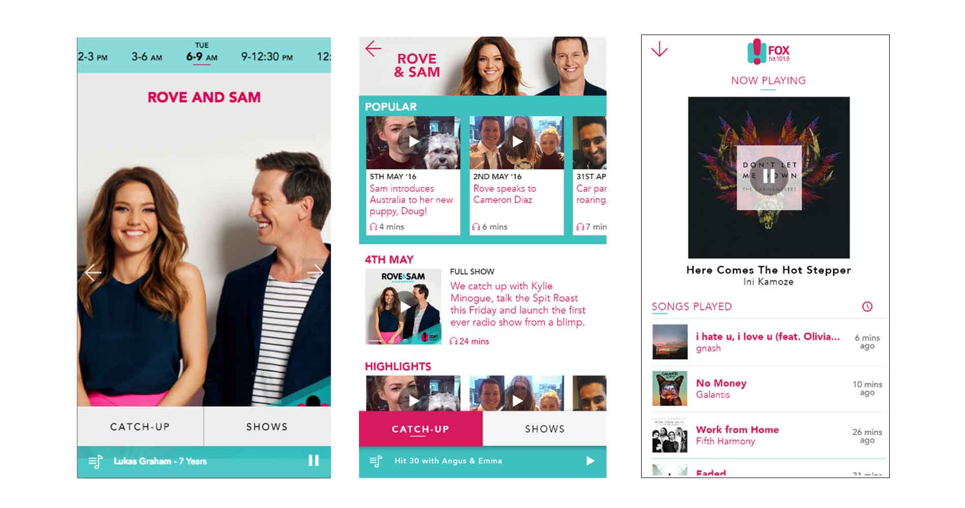
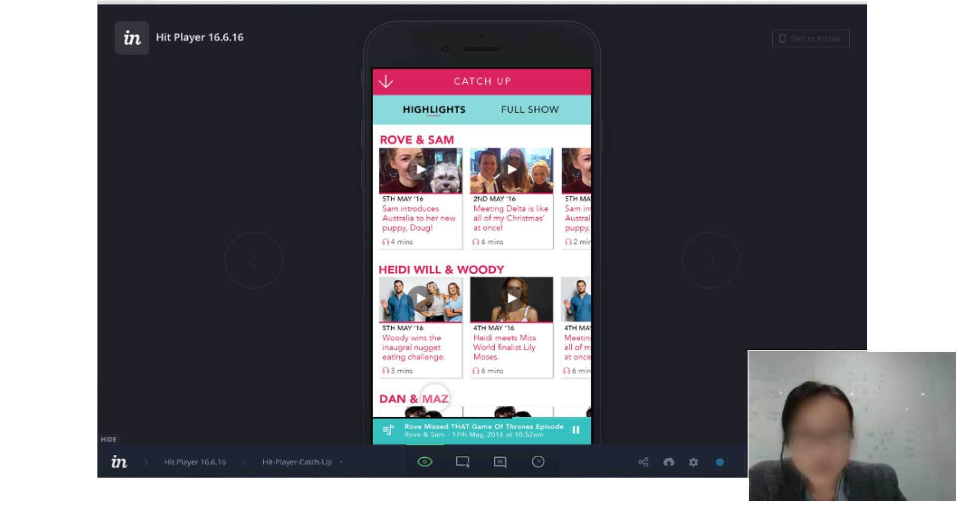
Users loved the song history on the hit player when I showed them so they could know who the artist and song name was. In the past they said that they had caught the last minute of a song and had no way of knowing what the song was.
Users also loved the 'Highlights' section that we created as personas told us that they might be only interested in an interview and didn't want to have to listen to the entire show.
From the testing participants didn't like infinite scroll for articles, as they wanted the feeling of accomplishment of reading the article and having infinite scroll took that away from them.
I also noticed that no one was clicking on the recommended articles at the bottom of the screen and the feedback that I got was "They're not interesting" or "I've already read those". This was a great opportunity to make the recommended articles more engaging by refreshing them more often.
With the videos following people down the page people liked as they could watch the video and red comments at the same time.
Participants liked the follow button as participants said they would follow Fashion and Lifestyle categories, which would them encourage them to come back to the website.
When I tested the progress bar to encourage participants to read more of the article 12/15 particpants didn't even notice it and the ones that did notice it said that it wouldn't encourage them to read more, it was only if they found the content interesting that they would read further.
Results
From the testing we decided to pursue videos following people down the page, follow buttons for categories, refreshing the recommended articles at the bottom of the screen and song history on the player. Based off these feature implementations SCA saw..
- Page views per session jumped from 1.25 pages to 2.75 pages
- Average duration went from 53 seconds to 1 minute and 20 seconds
- Returning visitors went from 61% to 73%
- After talking to users they said they did feel empowered and in control thanks to the show highlights section and the song history list on the player screen