My Role
I was brought into the Bank as a UX consultant along with two front end developers and four data consultants. After receiving the initial brief, I had to emerse myself into the business. I had lots of questions:
- What are the processes?
- How many are there?
- What are the relationships between each of the processes?
The Challenge
This Bank being such a large company understandably has a lot of departments and processes. This can create alot of red tape that needs to be cut. This was certainly the case when it came to internal approvals. Managers were getting their mailboxes filled up constantly with emails about approvals.
Current state of play
- 35,000 Approvals being generated by three systems per month
- 4,348 Approvers issued with mobile phones, yet only desktop applications for approvals
- 10 plus different areas to approve and review requests
"I want to be able to see all of my approvals without being spammed in my inbox"

Stakeholder Interviews
We got together all the managers of each of the departments; Human Resources, DAS and P2P and asked them these questions. We also asked them to give us a run down of how they review and approve requests at the moment. We found out that some approvals required multiple levels of approval. Some of the problems that kept on emerging was slow communication between approvers and that is was hard to keep a of who has approved what.
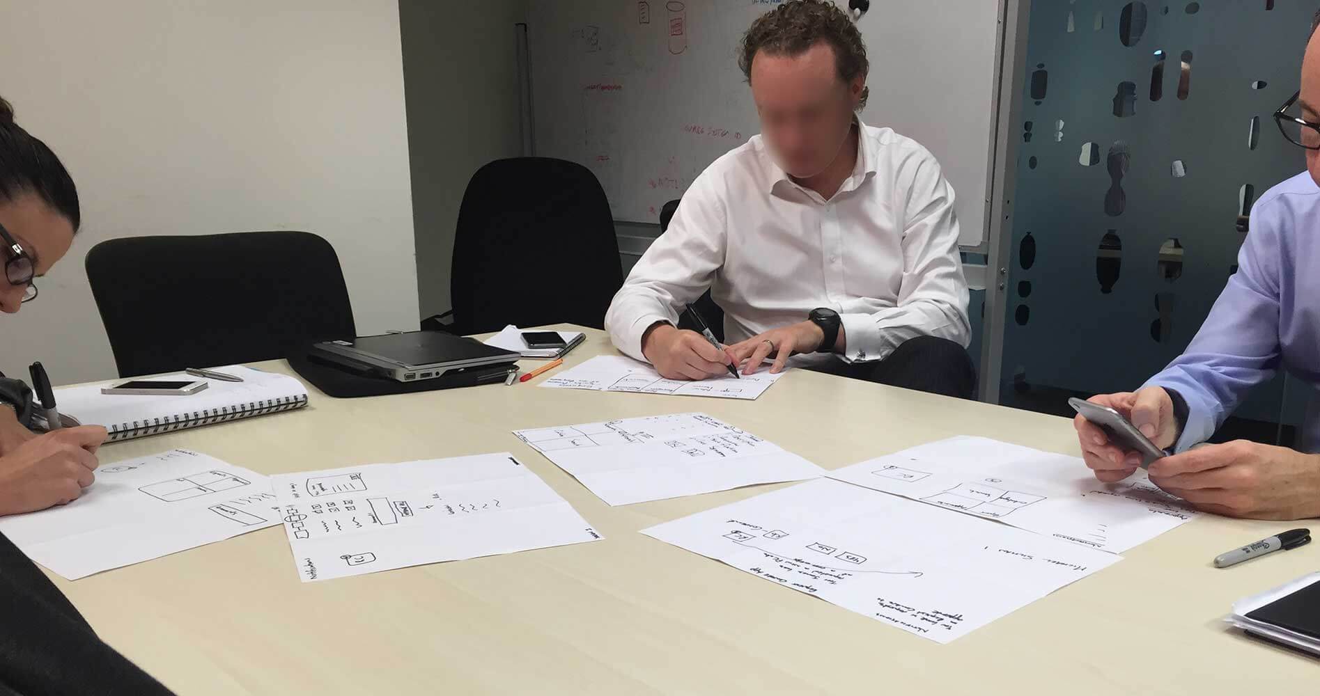
Design Workshop
After taking notes of our initial meeting we brought them back again for a design workshop. We explained to them that you don't need to be an artist to take part. We got them to design their perfect idea of how this new approval system might look. The exercise we did was called 'Crazy 6'. With an A3 piece of paper you fold it into six squares. All of the managers were asked to come up with an idea in each of the six squares in 10 minutes.
Analysing the research
After the design workshop, it was clear that the managers needed more time in the day to work on getting through all these approvals. Some of their comments were that they would love to be able to move approvals along on their daily commute on public transport to and from work. This means that a mobile friendly solution was a must. Given the confidential information in these approvals it would have to be an application that they can log into.
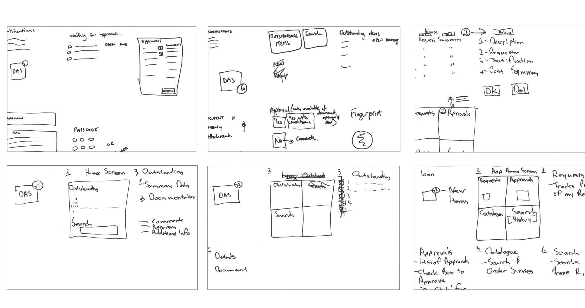
Now armed with this information I came up with some initial sketches.
These sketches allowed me to get all of my thoughts down on paper and how all the components would work together. I was focusing on summarising the total cost of all the approvals people have to go through and outline where on the approvals list they stood. Allowing for more transparency in the process. After a few revisions I then translated my sketches into an Illustrator file.
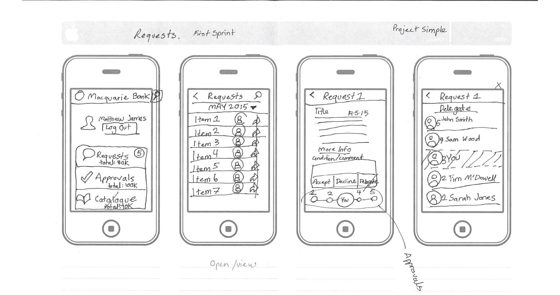
Wireframes
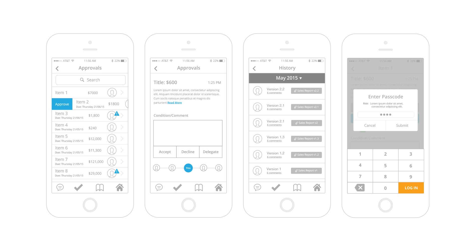
After a few revisions of the wireframes of how I imagined all the parts to work together. We then brought the managers in to test them.
I asked the managers to complete tasks that they normally would on the old system and to mark in red marker anything that is confusing or doesn't make sense. Based on the managers feedback I reworked the wireframes. Once these were confirmed, I then moved onto high fidelity wireframes. I created the high fidelity wireframes in Sketch.
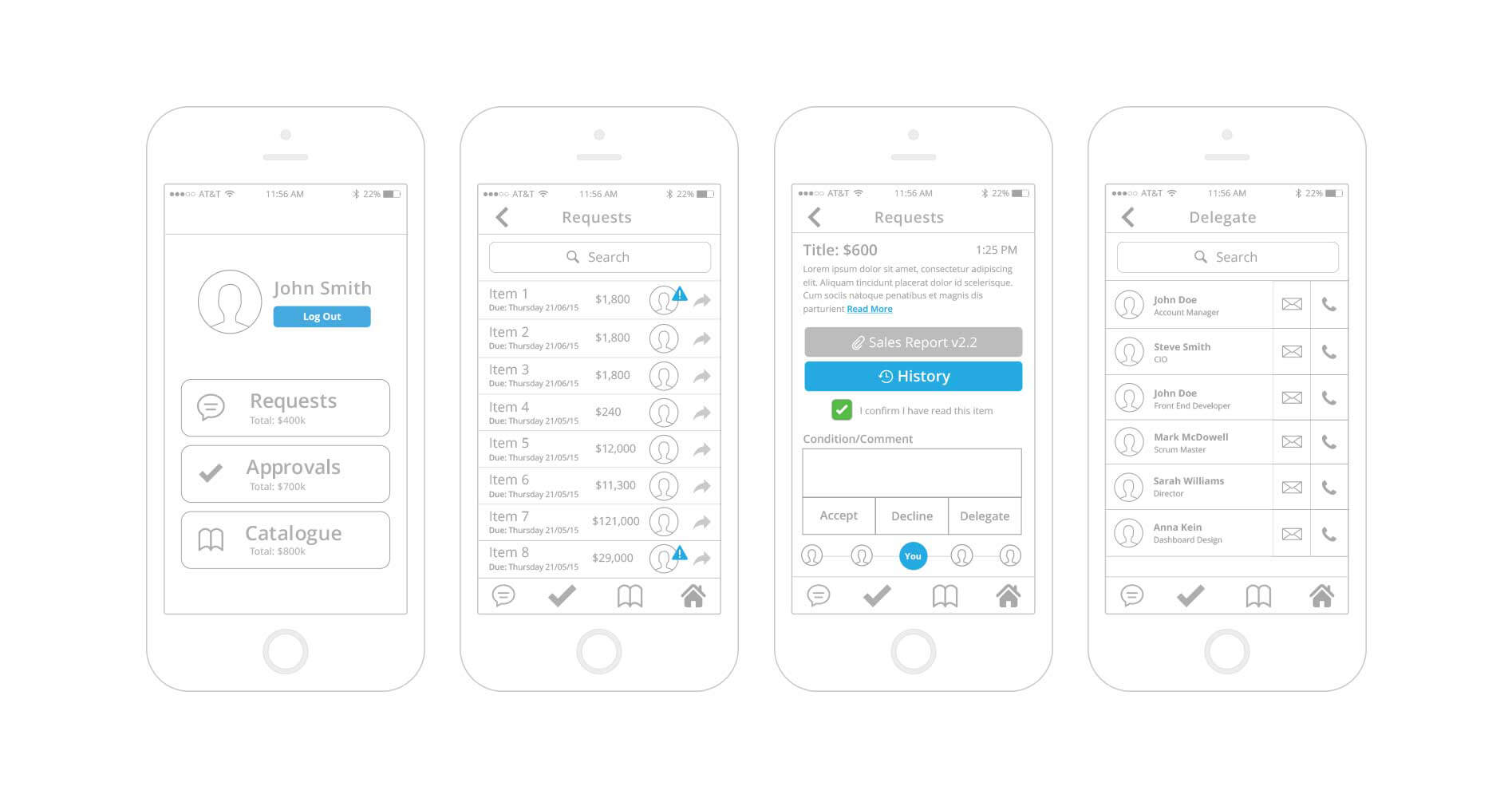
High fidelity screens
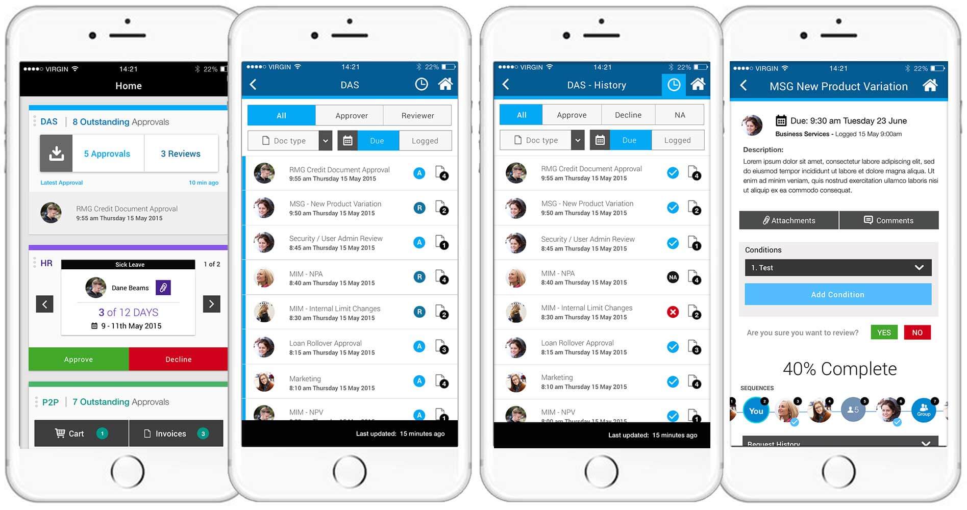
DAS system screens
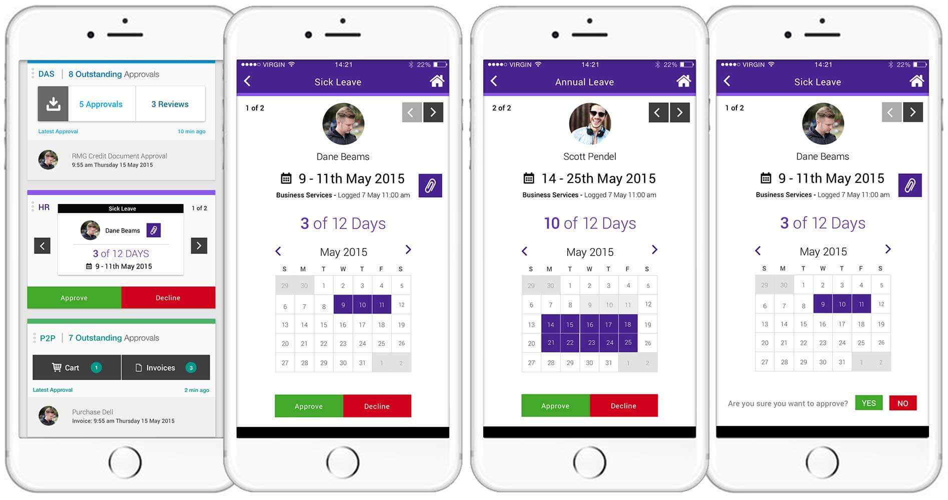
Human resources system screens
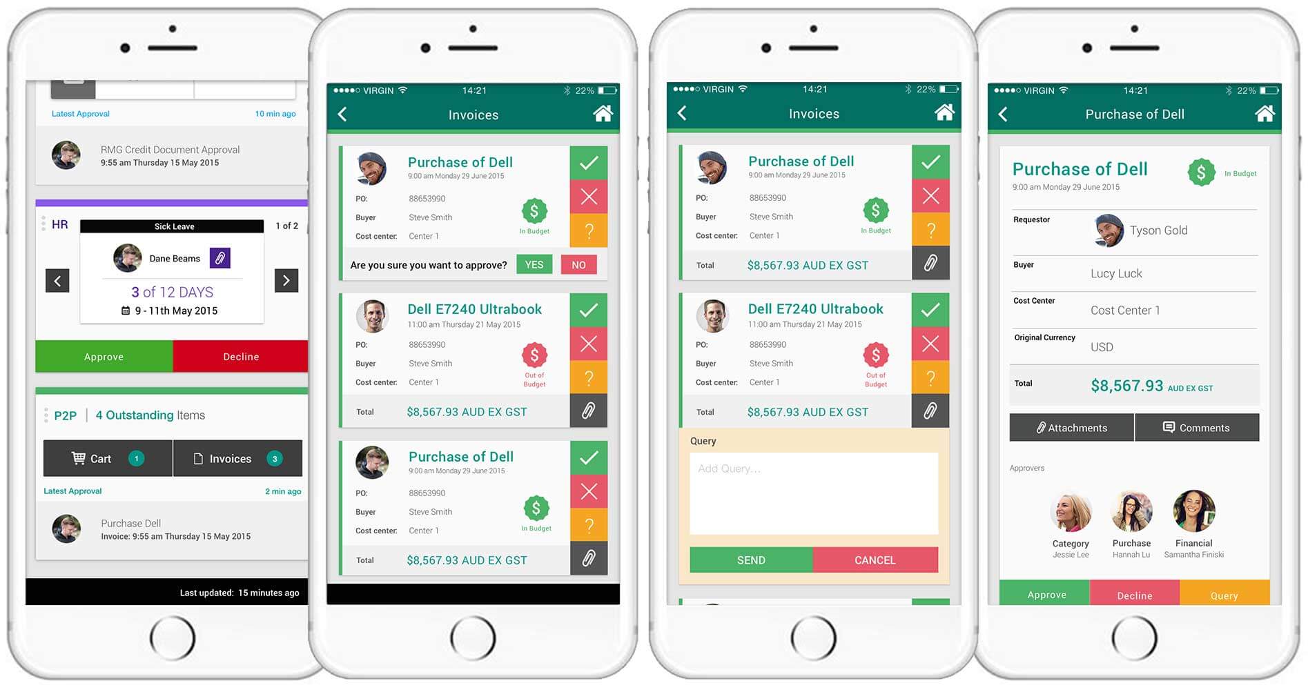
Procure to Payment system screens
The three systems we focused on were; DAS,P2P and Human Resources for the first release and later introduce all the other internal systems into place. Once the high fidelity screens were signed off I imported them into Invision and turned them into a prototype. I always love giving users a prototype, having them interact with the product the way it was intended to bring a smile to people's faces and at this bank it was no exception.
To view the prototype, please click on the link below. Thank you.
Invision Prototype